Wednesday, February 27, 2008

Long live print ... ?

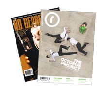
Small circ magazines No Depression and Resonance are have announced they will fold under financial pressures.

It seems newspapers aren't the only ones feeling the pinch in the day of the Internet.

Ed Ward, Berlin Bites blogger, and magazine writer wrote last week about the two small magazines and, in part blames a restructuing of the second-class postage system approved last year:
"The new rates, though, were bizarre: the more magazines you shipped, the less each unit cost, and smaller-circulation magazines were burdened with unreasonably higher per-unit costs, instead of everyone paying the same rate. But that's what happens when you allow big business to write the laws."
Although I've never heard of these publications, I subscribe to a couple hardly known periodicals myself. And it doesn't look good for my seldom-discussed hope to one day start up a magazine of my own ...

Monday, February 25, 2008

Albuquerque Tribune signs off

The Albuquerque Tribune published it's last issue on Saturday.

E.W. Scripps Co. tried to sell the afternoon paper for 6 months after deciding the market for the paper was no longer there.

ABOUT THE ALBQUERQUE TRIB:
  • Circulation hit 9,600 in January, it had been 42,000 in 1988.
  • Worked under a JOA with the Albuquerque Journal
  • Won a Pulitzer in 1994 for "The Plutonium Experiment"
  • NewDesigner.com said "The Trib long had a fine reputation as a visual paper."

As for the last one, I had no idea what they looked like. So, I hunted down this recent front page on Wendi Wilkerson's News Page Designer portfolio:

Wednesday, February 20, 2008

The big cheese

What will they think of next?

Tuesday, February 19, 2008

Winner, winner, winners

SND has announced four World's Best-Designed Newspapers. None of them are in the U.S.
Akzia in Moscow, daily, circulation 200,000
Expresso in Paco de Arcos, Portugal, daily, circulation 140,000
Frankfurter Allgemeine Sonntagszeitung in Frankfurt, Germany, weekly, circulation 320,000
The Guardian in London, daily, circulation 355,750

See why the judges chose them:


SND29: The 2007 World's Best-Designed Newspapers from Society for News Design on Vimeo.

Get the full lowdown here.

Castro on the cover

Breezing, through today's West Coast newspapers dominated by headlines -- on beef recall, Pakistan elections, the Clinton/Obama race and what's up in Kosovo -- you wouldn't know the biggest story of the day: Fidel Castro handed the reins over to little brother Raul in the middle of the night.

Unless of course, you were reading one of these papers:


Kudos to the Pacific Time Zone papers that made what must have been a very late deadline switch. You can see major Northwest newspapers here.

It must be noted that the Seattle P-I got in a summary-refer in its front page rail, as well.

I'll be looking forward to seeing how other newspapers treat the retirement of Cuba's president after nearly half a century in power.

Monday, February 18, 2008

Hold your breath

SND judges running around Syracuse University are announcing the World's Best-Designed Newspapers tomorrow at 2 p.m. EST.

Who will it be? Don't worry, I'll post the list as soon as I know.

Until then, here's a 8-minute video from our friends at SND in which the judges explain makes a world's best-designed newspaper:


SND29: What makes a World's Best? from Society for News Design on Vimeo.

Keeping in clean in Chicago


I'll be picking a standout page of the week from my daily visits to the many sites where designers display their stuff.

This week:
The Chicago Tribune.

I like the stark clean look of this page today. There's nothing fancy. Just an amazing photo, with a great crop. Those eyes are all I need to enter this page and carry me into the content. That and that excellent hierarchy of headlines. No fancy sidebars, alt presentation of glitzy extras: just good, clean design.

The Chicago Tribune has gotten cleaner and simpler with fresh new flag on Jan. 14, when they ditched the 25-year-old white on blue nameplate, according to the SND Update blog. Here's a clip from a Q&A with the paper's AME of design and architect of the new masthead:


"What was the thinking behind changing the blue background to white in the Tribune's flag?
Joe Knowles: "We felt it was time to update it. Our world has changed quite a bit since we introduced the white-on-blue version 25 years ago. Color was a relatively new thing on Page 1 back then. We knew the blue bar had become a powerful brand identifier for the Tribune... it was originally developed to stand out and be distinctive and it certainly did its job. But it had become overpowering in a way. It was a difficult visual element to overcome on the page. The new one lets the content come forward. That's how we want to distinguish ourselves now."

I couldn't agree more. The page above is a perfect example of how the Tribune is putting content first.

Monday, February 11, 2008

Fasten your seatbelts

Ladies and gentlemen, if you direct your attention to the left side of the screen you'll find links to some (Web) sites to see, blogs I check for inspiration and blogs of my fellow journalism cronies.

Enjoy!

Also, I apologize for my lack of updates in early 2008. Good thing I didn't make a New Year's resolution of it. I've actually been quite busy recovering from a severe allergic reaction to a type of penicillin. But now I'm back and I have plenty of trick up my sleeve for future updates. So check back often.